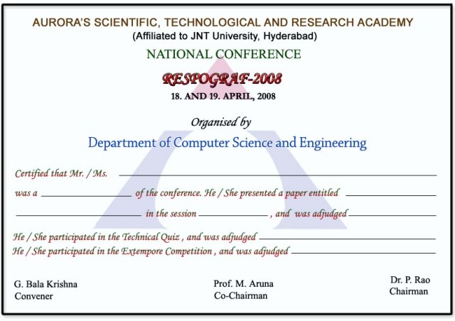
Participation Certificate for Respograph 2009
A participation certificate design for Respograph 2009. The challenge with certificates is balancing formality with visual interest — they need to feel official without looking like every other template.
A participation certificate design for Respograph 2009. The challenge with certificates is balancing formality with visual interest — they need to feel official without looking like every other template.
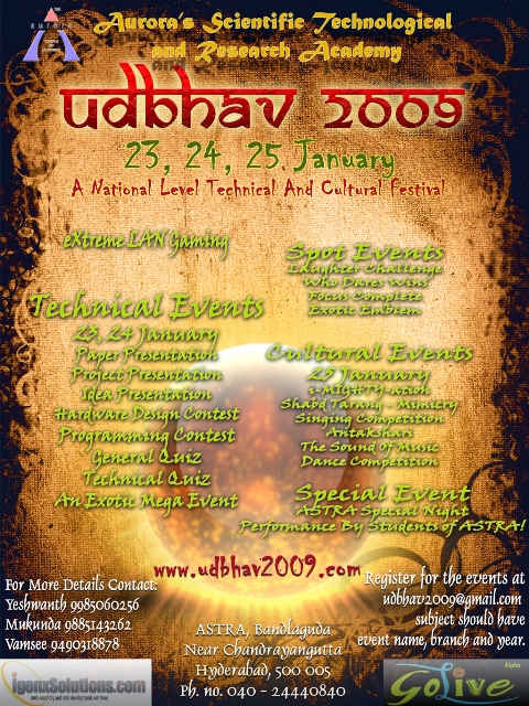
Flyers for Udbhav 2009. These were the pieces you’d hand out at events or pin up around campus — small format, quick to read, carrying the same visual language as the posters. This was part of a larger design effort for Udbhav 2009 that also included posters, stickers, mini banners, the souvenir book cover, the participation certificate, and the stage backdrop.

A few logo concepts for “We The Migrants”. The brief was to capture the idea of movement and identity without resorting to cliches.
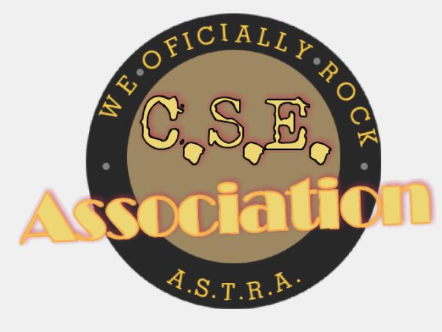
The Computer Science and Engineering Association at Aurora University needed a new logo, so they put out a call for designs. I submitted some entries. What follows is the full range of my “talent” on display, from “I can see the vision” to “what were you thinking”. I really wanted them to know that the C.S.E. Association rocks. I also couldn’t spell “officially”. The logo reads “WE OFICIALLY ROCK” around a circle with “C.S.E.” in the middle and “A.S.T.R.A.” at the bottom. The typo does most of the work here. ...
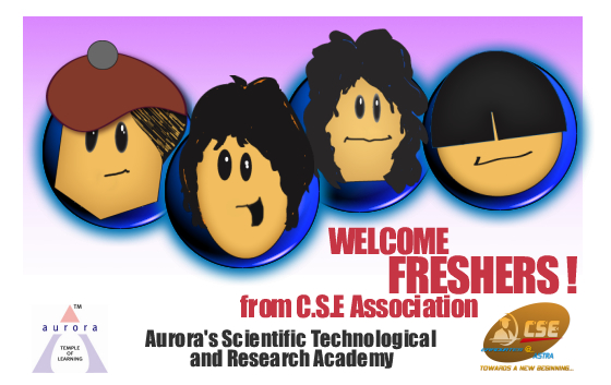
A welcome banner for the fresher’s induction. Big, bold, and impossible to miss — the kind of thing that needs to read clearly from across a hall.
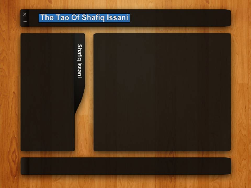
I put together a simple website template that uses a dark color scheme over a wood texture background. It is meant to be flexible enough for any kind of business site or personal portfolio. The design is straightforward. A navigation bar sits at the top, followed by a main content area and a sidebar on the right. The wood texture gives it warmth without being distracting, and the white text on it reads fine on most screens.
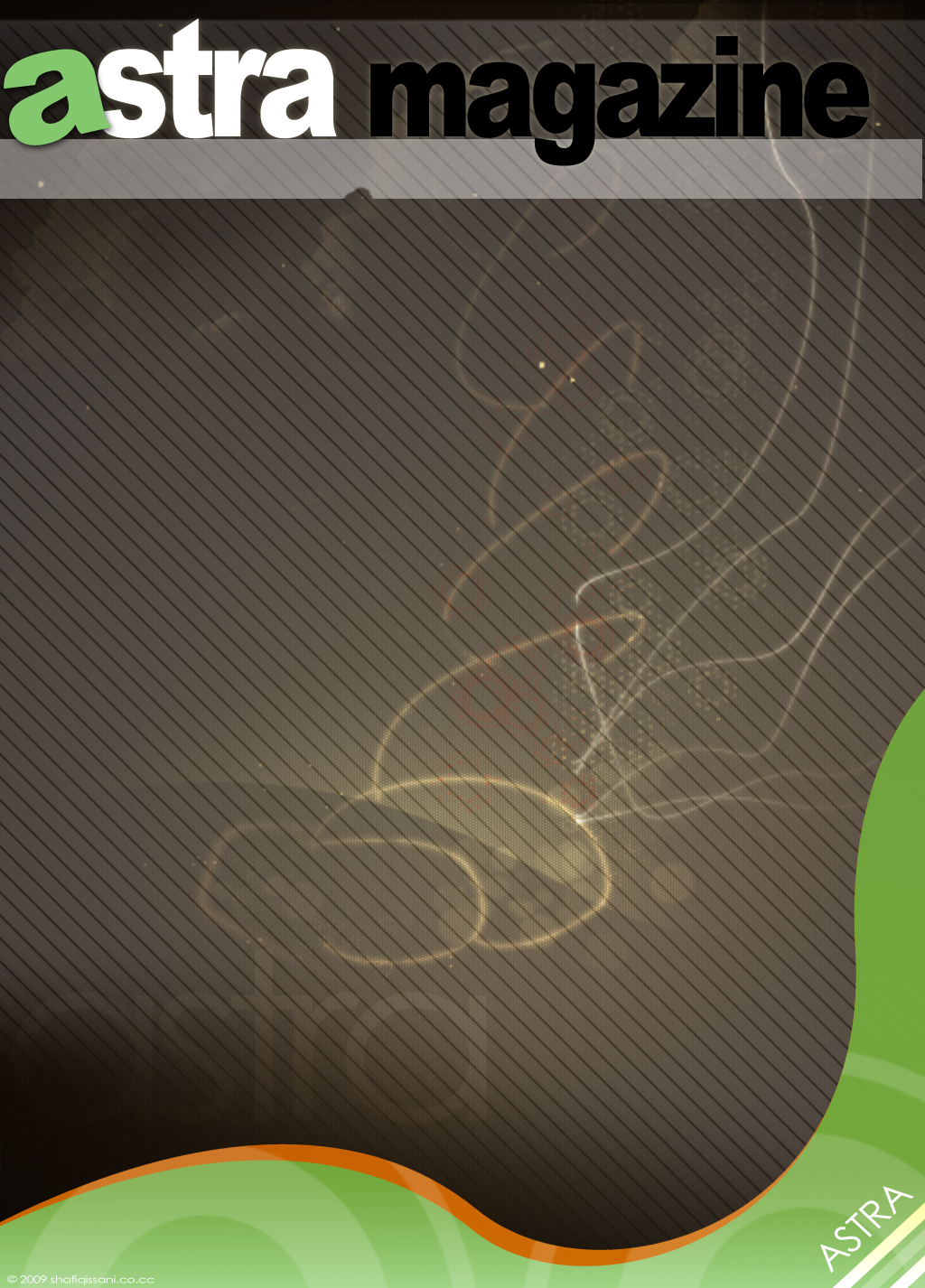
I was asked to put together a cover for ASTRA, the college magazine. The brief was loose enough that I could experiment with typography and layout without worrying too much about brand guidelines or committee sign-off. The main challenge was making the masthead work at different scales. College magazines tend to be printed cheaply on decent paper, so the design needed to hold up even when the press wasn’t perfect. I kept the palette simple and let the type carry the weight. ...