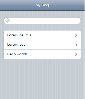
iOS-inspired WordPress Theme

I made a WordPress theme that looks like iOS

I’ve been staring at my iPhone all day and I got tired of how every WordPress blog looks the same – flat headers, generic sidebars, the whole deal. So I spent the evening building a theme that actually looks like iOS, and I’m putting it up for anyone who wants it. The whole thing is built around that familiar iOS table view look. Striped background, rounded white cells with the little chevron arrows, a search bar at the top that matches the system aesthetic. It’s not trying to be a 1:1 copy of the iPhone – it’s just borrowing enough of the visual language that people who spend their days in iOS will feel at home. ...
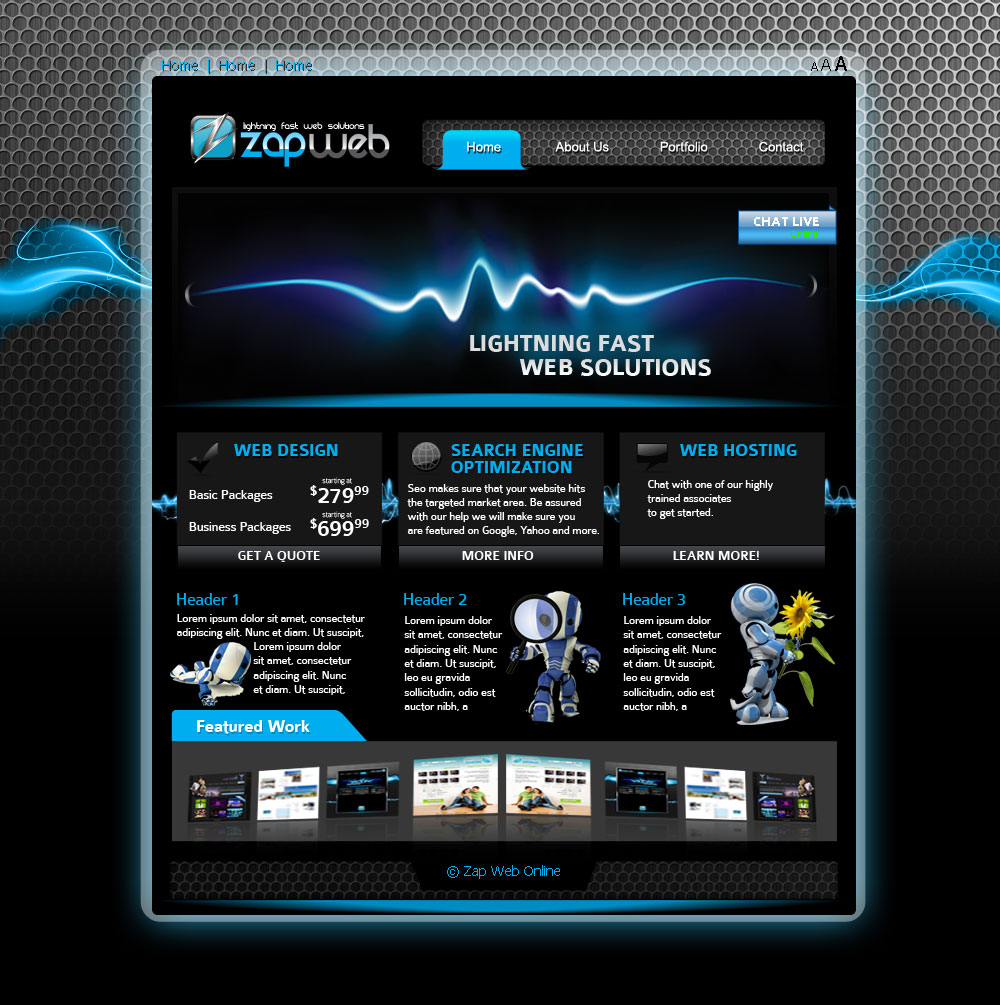
Zap v3 v2344

Black & Blue — a free PSD template

This is a template I designed for Zap Web Online — a web solutions company that wanted a dark, techy look. The brief was fairly open: make it look fast, modern, and a bit futuristic. Hence the name. The layout is a fixed-width centre column on a textured metallic background. The header has the Zap Web logo on the left, a four-item navigation bar (Home, About Us, Portfolio, Contact) with blue highlight on the active tab, and a “Chat Live” button tucked into the top right of the banner. The banner itself is a glowing blue waveform against a black gradient with the tagline “Lightning Fast Web Solutions”. ...

Designer Blue Page Website Template

Designer Blue Page Website Template

A clean, blue-themed website template. Simple layout with plenty of white space.

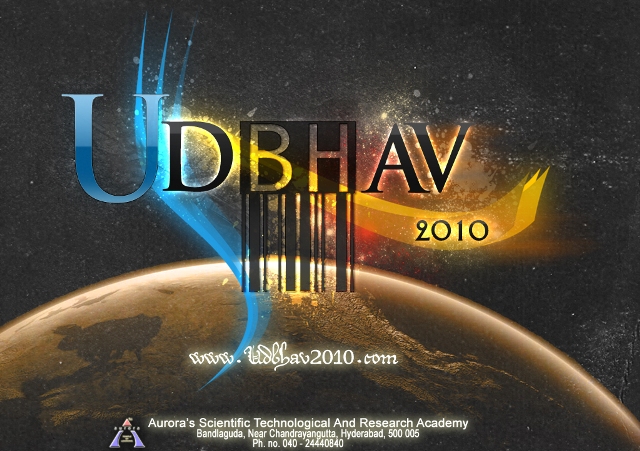
Udbhav 2010 stage backdrop

Backdrop for Udbhav 2010

Udbhav is an annual cultural festival that brings together students through music, dance, and creative expression. For the 2010 edition, I designed another stage backdrop – this time with a slightly different approach to the visual language. The backdrop needed to function as the stage’s focal point while leaving room for the performances. It had to read clearly from the back of the venue, carry energy without overwhelming the stage, and fit the overall visual identity I was building for Udbhav that year. ...

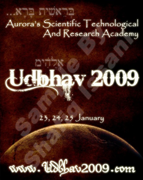
Udbhav 2009 souvenir book cover

Book Cover for Udbhav 2009 Souvenir

Along with the posters, flyers, and backdrop for Udbhav 2009, I designed the cover for the event souvenir book. The brief was straightforward: something that felt cohesive with the rest of the visual identity while standing on its own as a keepsake. This was part of a larger design effort for Udbhav 2009 that also included posters, flyers, stickers, mini banners, and the stage backdrop.

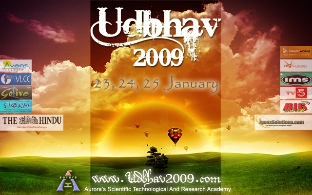
Udbhav 2009 stage backdrop

Backdrop for Udbhav 2009

Udbhav is an annual cultural festival that brings together students through music, dance, and creative expression. For the 2009 edition, I was asked to design a backdrop – a large-scale visual piece that would serve as the stage’s focal point. The challenge was to create something that felt both festive and contemporary. The design needed to work from a distance, communicate energy, and complement the performances happening in front of it without competing for attention. ...

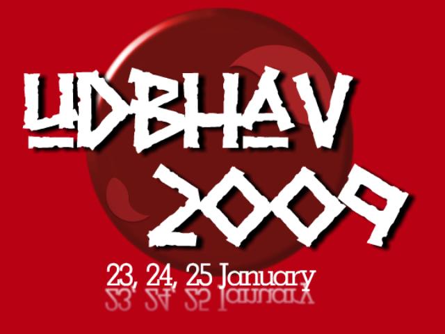
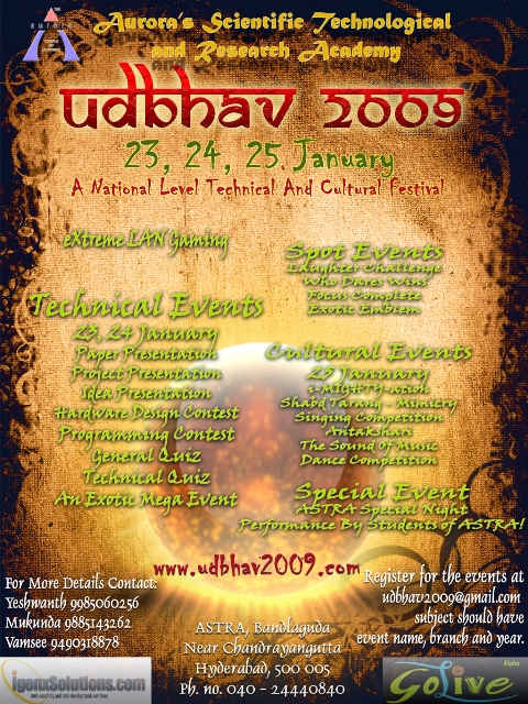
Udbhav 2009 poster, red colour way

Posters for Udbhav 2009

A set of posters for Udbhav 2009. The goal was to build a visual identity that felt fresh and energetic, something that would stand out on notice boards and social media alike. Each poster uses a different colour way but shares the same typography and layout so they read as a family. ...

Udbhav 2009 sticker, brown design

Udbhav 2009 Stickers

Stickers for Udbhav 2009. Small format, but they need to carry the same visual identity as everything else. Designing at this scale means every detail has to earn its place — there’s no room for clutter. This was part of a larger design effort for Udbhav 2009 that also included posters, flyers, mini banners, the souvenir book cover, the participation certificate, and the stage backdrop.

Udbhav 2009 participation certificate

Participation Certificate for Udbhav 2009

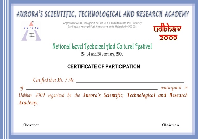
A participation certificate for Udbhav 2009. Same design problem as the Respograph one — make it feel official without looking like a template. This one had to sit within the wider Udbhav visual identity, so the palette and typography carried through from the posters and banners. This was part of a larger design effort for Udbhav 2009 that also included posters, flyers, stickers, mini banners, the souvenir book cover, and the stage backdrop.

Sound of Music event mini banner

Mini Banners for Udbhav 2009 Events

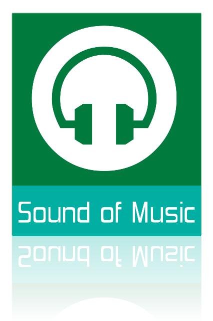
Small banners for the individual events at Udbhav 2009. Each one needed to be instantly readable from a distance while staying consistent with the overall visual identity. This was part of a larger design effort for Udbhav 2009 that also included posters, flyers, stickers, the souvenir book cover, and the stage backdrop.

Respograph 2009 participation certificate

Participation Certificate for Respograph 2009

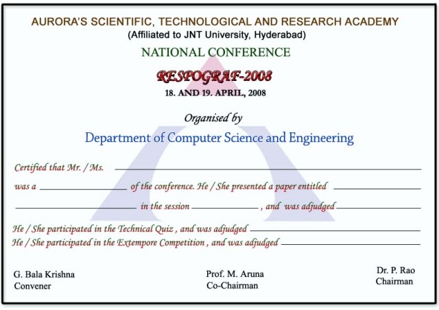
A participation certificate design for Respograph 2009. The challenge with certificates is balancing formality with visual interest — they need to feel official without looking like every other template.

Udbhav 2009 flyer

Udbhav 2009 Flyers

Flyers for Udbhav 2009. These were the pieces you’d hand out at events or pin up around campus — small format, quick to read, carrying the same visual language as the posters. This was part of a larger design effort for Udbhav 2009 that also included posters, stickers, mini banners, the souvenir book cover, the participation certificate, and the stage backdrop.

We The Migrants logo concept 1

Logo Samples for "We The Migrants"

A few logo concepts for “We The Migrants”. The brief was to capture the idea of movement and identity without resorting to cliches.

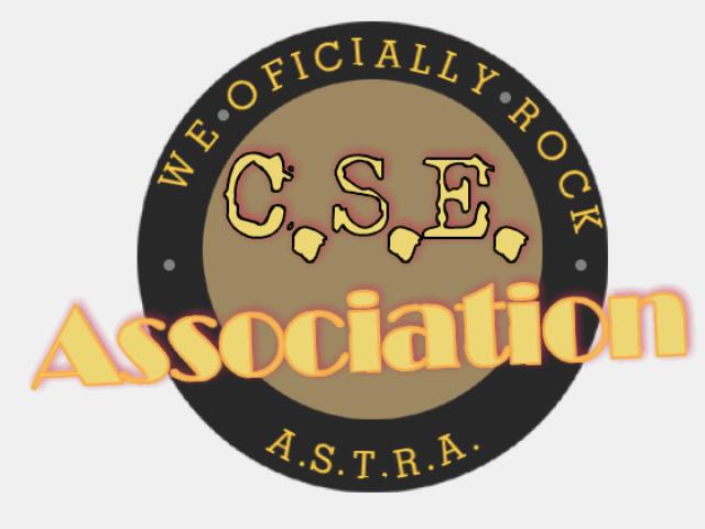
C.S.E. Association logo with 'WE OFICIALLY ROCK' around the border and A.S.T.R.A. at the bottom

Logos for Computer Science and Engineering Association

The Computer Science and Engineering Association at Aurora University needed a new logo, so they put out a call for designs. I submitted some entries. What follows is the full range of my “talent” on display, from “I can see the vision” to “what were you thinking”. I really wanted them to know that the C.S.E. Association rocks. I also couldn’t spell “officially”. The logo reads “WE OFICIALLY ROCK” around a circle with “C.S.E.” in the middle and “A.S.T.R.A.” at the bottom. The typo does most of the work here. ...

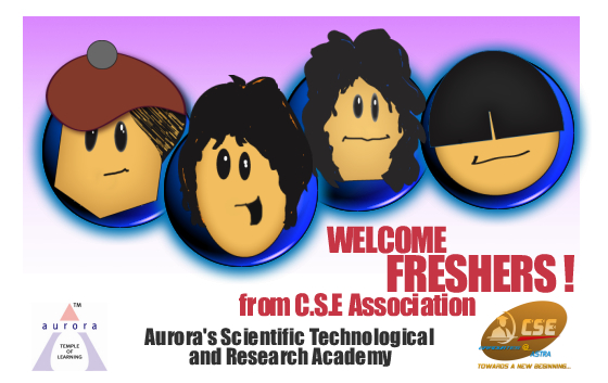
Welcome Freshers banner

Welcome Banner For Freshers

A welcome banner for the fresher’s induction. Big, bold, and impossible to miss — the kind of thing that needs to read clearly from across a hall.

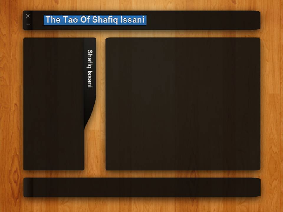
black on wood website template preview

A modern black on wood website template for any business or personal portfolio

I put together a simple website template that uses a dark color scheme over a wood texture background. It is meant to be flexible enough for any kind of business site or personal portfolio. The design is straightforward. A navigation bar sits at the top, followed by a main content area and a sidebar on the right. The wood texture gives it warmth without being distracting, and the white text on it reads fine on most screens.

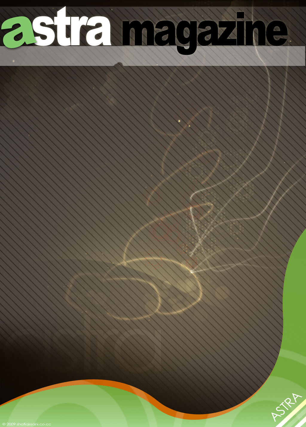
ASTRA magazine cover design

Cover Design for ASTRA College Magazine

I was asked to put together a cover for ASTRA, the college magazine. The brief was loose enough that I could experiment with typography and layout without worrying too much about brand guidelines or committee sign-off. The main challenge was making the masthead work at different scales. College magazines tend to be printed cheaply on decent paper, so the design needed to hold up even when the press wasn’t perfect. I kept the palette simple and let the type carry the weight. ...